The Vibrant, Kaleidoscopic Color Theory of Christopher John Rogers
If there’s anything that Christopher John Rogers cares even more deeply about than clothes, it has to be color. Since establishing his namesake fashion label in 2016, the Baton Rouge–born, Brooklyn-based fashion designer has quickly gained as much notoriety for his bold, kaleidoscopic color palette and poppy patterns as he has for his billowing, exquisitely silhouetted dresses. Eschewing—or at least pushing—any boundaries between “high” and “low,” “hard” and “soft,” or “masculine” and “feminine,” Rogers brings a fluid, unpretentious perspective to fashion, one that has swiftly landed him on an episode of Gossip Girl, red carpets (Lady Gaga, Beyoncé, and Rihanna have all donned his dresses), and into the illustrious halls of the Metropolitan Museum of Art in New York (two of his dresses were featured in the Costume Institute’s 2022 exhibition, “In America: A Lexicon of Fashion”). “The idea of a ball gown in a bodega feels not real,” he tells me in this Big Interview. “But how do you make that real or more possible than it currently is? I’m always thinking about that.”
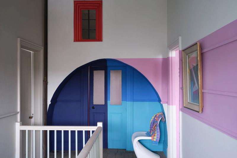
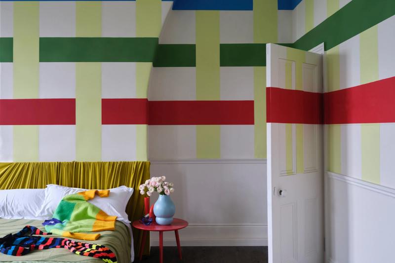
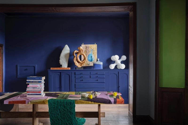
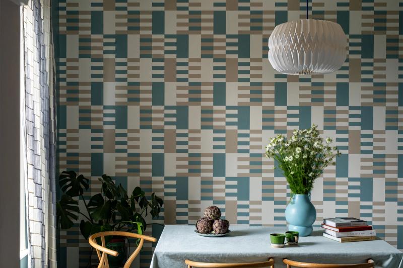
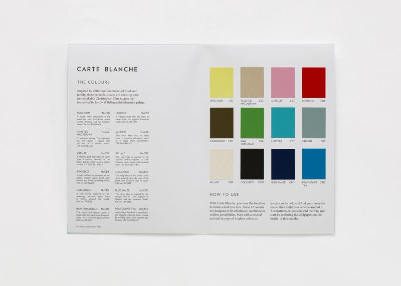
This month, Rogers is bringing his curiosities, obsessions, and observations of color to two new mediums in a collection with Farrow & Ball: 12 paint shades, ranging from a vibrant green (Raw Tomatillo) and a rich brown (Cardamom) to a silver blue (Sardine) and a muted pink (Shallot), in addition to three wallpaper prints, the Daniel Buren–esque Stripe, the Anni Albers–inspired Check, and the effervescent Dot.
Here, Rogers speaks to his various approaches to color, at once logical, esoteric, and instinctual; his collaboration with Farrow & Ball; and the powerful links he sees between comic books and fashion design.
Let’s start with a big question, especially within the context of your work: How would you describe your philosophies around color?
Hmm. I think it kind of lives in this liminal space between something incredibly visceral and incredibly cerebral. With my experience of art classes [at the Savannah College of Art and Design], all the way through my stint at DVF, where I worked with Jonathan Saunders, there were a lot of moments in between that allowed me to see the way that certain people use color differently. I was able to take my favorite parts of that and apply it to the work that I do now. It’s just a mix between what I instinctively feel is right and also the feeling that I want people to feel looking at the thing.
Could you elaborate on the liminal aspect of this?
With all of my work, the thing that I’m trying to make people feel is liminal. It’s in between many things. There’s this hackneyed reference of “hard” and “soft” and “masculine” and “feminine” that people love to say, which is a little bit eyeroll-y to me. It’s both, but neither.
The color can be bright, but it also needs to be incredibly specific. Maybe it needs to be a little bit more warm or a little bit more cool, or a little bit more yellow, or maybe add a dash of black to ground it in some way. Or, if we’re talking about silhouette, people love to throw these fifties, seventies, eighties references on the work that I do—and I definitely love those decades. It’s about that, but not. That’s where a lot of my work sits, or where I would like for it to actually sit, is in a space that is nowhere but everywhere at the same time.
People talk about the “timeless.” I like this idea of being in between time.
Exactly!
You recently collaborated with the paint company Farrow & Ball on the new Carte Blanche collection. How did you winnow it down to these particular shades and wallpaper prints? What was the process for creating this?
We started by going through all of the color references that I had in my library. Some were papers, some were fabrics that we had dyed. It was a mix of things.
One of the shades, Shallot, has an interesting story. I sent over a shirting fabrication, which had a red line, a blue line, and a white ground. There’s a machine they have that can digitize the median color between all of the colors present in something, to get you the truest color match. It ended up being this interesting light purple. So then we mixed that with another shade that I gave them a reference for, and we ended up with Shallot. It’s pink, but it’s a little blue. When it’s next to Romesco, it feels quite femme, but also earthy. That was the process for that one color. Some of the other colors are more straightforward.
I knew that I wanted every color or every hue present. So I wanted a purple, a blue, a green, a yellow, a red, so that it felt chromatic. Then, just a mix of colors that felt quite declarative, but easy to use. Some were more experimental, like Hog Plum. And then there were easy neutrals, like Cardamom and Blue Maize and Au Lait.
One of your references was Bauhaus textiles. You’ve previously noted your affinity to Josef and Anni Albers’s work in an interview. What is it about the Bauhaus and the Alberses that so appeals? I’m guessing Josef Albers’s Interaction of Color must be a sort of bible for you.
For sure! I think, more than anything—more than the philosophies or the history of the movement—I’m really just attracted to how immediately you can understand it and feel it, but also because of the hues involved or incorporated into the work, it can give you a completely different feeling.
One of my favorite classes [at SCAD] was “Color Theory,” just seeing how opacity of color can change the way you feel about something or how the proximity of certain analogous colors can make things feel quite different. That’s why I love the blues in this collection so much, because if you put Lobster next to Pea Flower Tea, it electrocutes them both in a weird way. And if you put it next to Blue Maize, then it feels somehow more sophisticated, for lack of a better word. I just love how color can be as cerebral as you want, or it can be as instinctual and “I like the way this looks” as you want.
Yeah, color doesn’t need to be over-intellectualized; it just is. To contrast this a bit—or, I guess, on-point here—you’ve described Bert and Ernie as your style icons. I was wondering what you think about them when it comes to color and clothes.
Yeah. Sesame Street is a big reference for me. I like to talk about how, for me, there isn’t really a hierarchy for references. Midcentury airport design is just as interesting to me as eighties Lacroix, which is just as interesting to me as Sesame Street, because they all make you feel something in some way. With Bert and Ernie, I love that they [always] wear the same thing. They’re not really overly concerned with trends. They do what they want, and they’re comfortable. That’s always really cool to me.
To turn to the world of art, you frequently reference the painter Sam Gilliam, too. Gilliam’s work is obviously a color explosion, but could you speak to the use of color in his work and why it resonates with you?
I just feels so honest. A lot of times, when people think of color, they only think of brights. And I appreciate that he can incorporate things that feel more muted, or secondary or tertiary, or nuanced, in his work, to balance out the brights. I love that with his—not frameless, but with his work that’s hanging, the shadows within the fabric also contribute to the color. I like that it feels familiar to me in some way that I can’t describe, but also uniquely him. I really like when people who are known for their colorwork have their own language that you can identify.
Do you have any other “peak” color references? For some reason, as I was looking at your work and preparing for this interview, I was thinking about the colors of the architecture of Luis Barragán.
His work was actually a reference for the way that we painted the rooms [for the Farrow & Ball campaign images]. I tried to think about color-blocking in that way.
This is different, but I sometimes look at sixties, seventies aspic jello dinners and those advertisements that are aged, or take-out signs that are in windows and fade. This idea of things that once were, that color now—that’s always interesting to me. Advertisements and this combination of things that feel quite jarring and unflattering is always really interesting. Things that aren’t really art I reference more than art, actually, but the way that they’re employed, I look at as art sometimes.
You’re only the second guest designer in Farrow & Ball’s seventy-seven-year history, following Kelly Wearstler. How does this feel for you to get this recognition from this not only industry giant, but color giant?
I’m really humbled, honestly. They could have picked anyone or asked anyone to do it, and they asked me.
More than anything, color’s the thing that I love the most, and that’s why I love to do what I do. That’s the first thing. Then, the second thing is when people get to use it as a tool to actualize themselves or make themselves feel good without it having to be prescriptive. I just feel really lucky to be able to have the opportunity to work with people who work with color and pattern in this way, but also have an understanding of—and a level of—quality. Sometimes, when people think of colorists in fashion, it can feel quite … not low vibrations, for lack of a better word, but, like, “Oh, it’s just a cute color. There’s a lot of work that goes into making it as good as it can be and also standing the test of time.
While we’re on the subject of color—although I guess this entire interview is really going to be mostly about that—I wanted to ask: When you think about your upbringing in Baton Rouge, Louisiana, what colors come to mind? Tell me about the colors of your youth and how those have evolved over the years into the work you do today.
It’s funny you bring this up. I wasn’t thinking of this, but the first house that I grew up in was painted—it wasn’t exactly Shallot, but it was a pink house. That’s a color that really resonates with me. My mom’s favorite color is red, and my favorite shade of red is what we call “crawfish.” It’s a cooler red. So I think of that. I also think of this weird, late-nineties teal color that was everywhere, on bedspreads and home furniture. I think of beige, terra-cotta, stucco, white sidewalks. Growing up in the South, people weren’t afraid to wear color. It was always a natural part of my growing up.
In another interview, I heard you mention that you became interested in fashion design in the fourth grade, through drawing comics with friends. Do you view the work today as a form of creating comic-book characters, albeit very elegant, dramatically silhouetted ones?
Yes, I think so, actually. We arrange the collection chromatically, which helps me organize a lot of disparate themes and elements that I can then telegraph to people, in a way that they can digest. It’s kind of similar to comic books, where you’re trying to capture people’s attention with depth of color, and how the character’s feeling, and what power they’re using. That was the first time that I really thought about clothing and what it can mean. I think I’m still using that same idea in the work I’m doing today.
This notion of fashion or costume as a superpower is pretty interesting, I think.
Yeah! My friends who wear the brand—or who I consider my muses, I guess—I wouldn’t say they necessarily use clothing as armor, but they definitely use it to telegraph who they are regardless of where they’re at, whether they’re at the park or at work or on the street grabbing a coffee. They’re not afraid to take up space. I feel like that is a superpower, for sure.
You’ve described your approach to fashion as “pragmatic glamour.” Can you elaborate on that?
I love something that feels like it shouldn’t be there. The idea of a ball gown in a bodega feels not real. But how do you make that real or more possible than it currently is? I’m always thinking about that. Just how to make work that teeters on borders. You can make it what you want it to be. It could be more formal or it could be everyday without it being a joke.
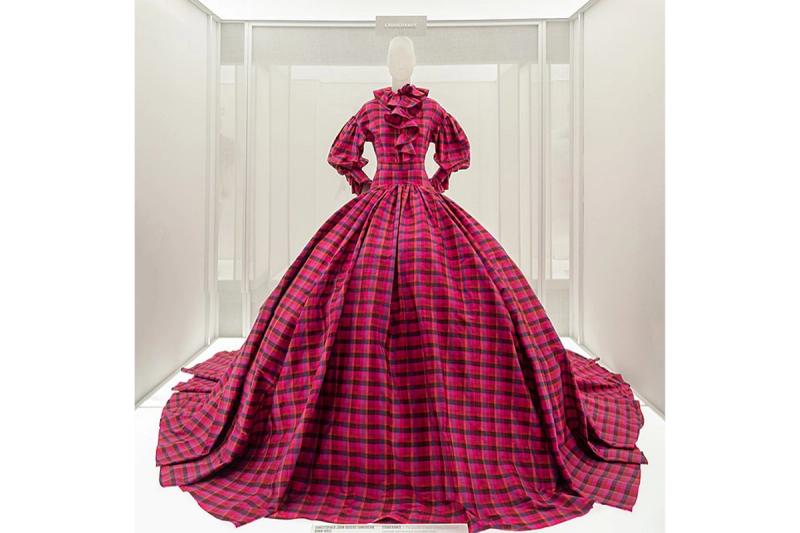
I love that you just mentioned the bodega. I was also thinking about—and wanted to bring up—the fact that last year you had these two dresses featured in the exhibition “In America: A Lexicon in Fashion” at the Met. Pretty much the opposite of a bodega. Now, having had time to reflect, what does it mean to you to see your work enter the hallowed halls of that place, but also be positioned within this pantheon of American fashion design?
Verklempt. Lack of words! It’s really cool to be next to people who you admire so much, like Marc Jacobs, Anna Sui, Geoffrey Beene. It feels not real, and it feels like it didn’t happen, even though I saw it. I feel like I have so much work to do, and I feel like I’ve also grown so much from the moments that were displayed there. It’s a cool reminder that it seems like people want to understand what I’m doing, and do understand, but then there’s also a lot of work that needs to be done from my end to push the conversation forward, I think.
Were there ever particular looks or dresses or pieces of clothing or fashion designs that, as you were coming up, you were like, “Oh, man, I want to create that!”?
I remember being on LiveJournal, and there was this designer or craftsperson who had traveled to Singapore and Germany. They would make things that they liked from the runway. She was making this sort of Dries van Noten look, and then she styled it with Margiela Tabis. That was the first time that I had seen that. I think I was in sixth grade. Then I started researching Dries, because I had never seen anything like that—something that felt like it was in many places at once. It opened my eyes, and it made me think that fashion didn’t have to just look one way.
Also, just that time in general, it felt like there was room for all of these different languages to exist at once. I feel that now things all kind of look the same. But I don’t know if that’s just because I’m in it. Maybe I’ll look back, and be like, Oh!
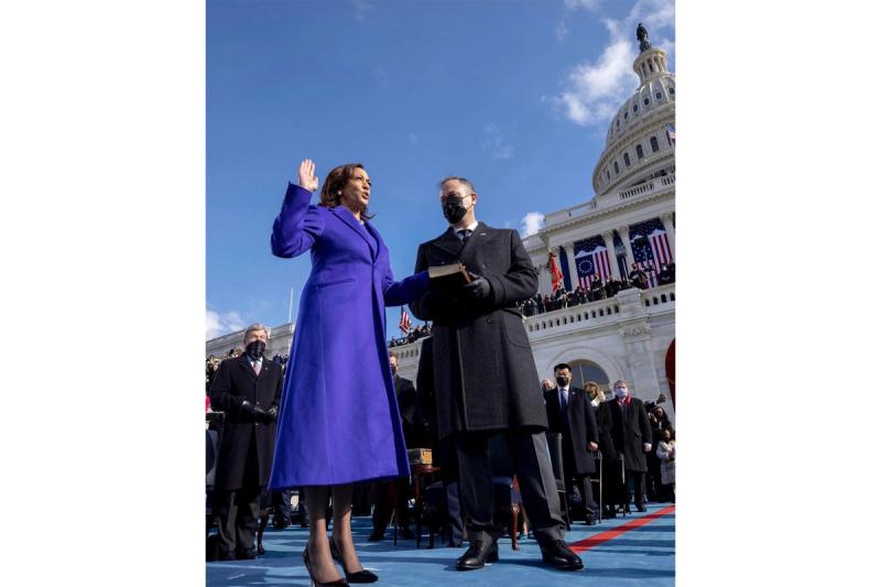
Could you also speak to this journey of taking what was basically a passion project at the beginning and turning it into this successful business and cultural catalyst? There have been these incredible moments, like Kamala Harris wearing your coat to the inauguration. It’s hard to believe it’s only been a few years.
I try not to think about it too much or ruminate on it. Maybe I should. I’m just happy that, up until this point, there have been so many different types of people that have found themselves in the work and can identify with it. It’s not just one type of body, or one type of personality, or one style. The range that we’re able to offer, and for people to then feel empowered enough to step out in that in public, I think is kind of the goal always. To not necessarily be for everyone, but to be for the people that desire it.
Early on, you launched your line by making custom pieces for Eve and Cardi B. Can you speak to those two designs in particular? How did those commissions come about?
Both of them wore pieces I made for my senior thesis collection in college. Eve wore this metallic lurex biker-jacket thing. That was my reason to move to New York. I had a friend at the time who worked for Eve’s stylist at the time. She showed her my lookbook, and they wanted to pull a few pieces. I could have just shipped them to them, but I was like, “Maybe I should just go to New York.” I really knew that I wanted to live in New York, and that I couldn’t do what I wanted anywhere else. So then I moved there. I trekked probably four garment bags full of my collection on a train from Bed-Stuy to the Upper East Side, where they were fitting. I think it just speaks to the tenacity. Looking back, it’s actually kind of crazy what I would do to just make a moment happen.
The same thing happened with Cardi B’s stylist. Cardi B ended up wearing a coat that I collaborated with Saga Furs on to the BET Hip Hop Awards. This was, I think, the beginning of her fashion renaissance. That was the first time I felt the residual effects of celebrity dressing. That day, I got five thousand followers on Instagram, and at the time I had only a few followers. I think it just showed me that there was some interest in the work, and that it was different from what else was being offered.
At the beginning of this interview, you mentioned DVF. How did your time there impact you?
In a few ways. Jonathan Saunders was the creative director when I was there. From my experience of working with him, he was very much inspired by art, and would pull color from that. It was never really about the clothes; it was always about the colors. I think that was the first time that I really considered quite muted colors as something significant enough to be impactful.
Diane had her own references, which usually were seventies, eighties jewel tones. Seeing her perspective through Jonathan’s perspective, and then us having to use our perspective to work through that, was really interesting. It was also about making clothes that are wearable. “Wearable” or “commercial” doesn’t necessarily have to be a bad word, I learned there.
You’ve previously said that you find the continual pace and churn of fashion frustrating. To counter this, you’ve created an off-calendar, once-a-year runway showing. Could you talk about this decision and what it offers you?
We finally figured out exactly what we want our cadence to be, so we’ll be moving forward with that. That includes one runway show, because that’s what we can afford at the moment. I’m such a fan of fashion and fashion history. So many of my favorite designers no longer exist because they weren’t able to do what was best for them. They had to perform for the industry. I’m lucky enough to be in a position where I can articulate what that means for me and my business. So we’ve decided to only do one show. Then we do a lookbook, but two collections a year. They’re both preseason—that’s when stores usually have the most budget for buys. The clothes get to sit for six months without going on sale, which is great.
It also more evenly splits up the development calendar. We make some clothes with vendors overseas. Italy will close at one part of the year; China closes at one part of the year. [This calendar is] the best thing for us right now—for finances, for logistics—and it also separates us a little bit from everyone else. I’m not saying I would never turn to on-calendar, but for now, this is what’s best.
This sounds like a 101 on how to run a sustainable independent fashion brand right now.
Yeah, it’s so hard. But we’re making it.
I appreciate that you mentioned the performative aspect of fashion. I wanted to finish our conversation with a quote that the fashion critic Robin Givhan wrote of your work in The Washington Post in February 2020: “Rogers performs fashion as an act of cultural inclusion. He performs it like a rebel leading a charge against assumptions about elegance. He performs it as a counterargument to today’s pessimism about the viability of the fashion industry as a place where crazy dreams are nurtured and can ultimately thrive.” It’s not lost on me that the Covid-19 pandemic, George Floyd, and the rise of the Black Lives Matter movement arrived right after she wrote that. Now that it’s been three and a half years since, what are your thoughts on that quote, and on the time you’ve spent since then building your brand?
It’s interesting what people can register from your work without you having to say anything. When we first started showing collections, my friends and I, and even up until now, I guess, it was never really about: What box do we neatly sit in? It wasn’t edgy and it wasn’t boho, and it wasn’t all of these different, easily definable labels. It was its own thing.
For me, there were always examples of people who made work regardless of what the industry at large felt was tasteful or on-trend or respectable. My work was never that, because it just felt exciting to me, which to me was like, “Oh, it must be valid then. If I like it, then it has to be okay.” Which may be a little bit delusional, a little bit juvenile.
But at the time I didn’t care. I guess delusion was a superpower, in a way: “I’m just going to make this thing. I think it’s cool.”
It was also just a testament to tenacity again: “I need to make this thing.” We didn’t have any investors. We still don’t. It’s still self-funded. We exist because we sell clothes. We’re a small business. We don’t have accessories, we don’t have jewelry, we don’t have whatever. We sell clothes—and we sell kind of weird clothes. I think [it was important to] not think about that and just do what we needed to do.
Yes, it’s this idea that your clothes stand strong and proud in their reason for existing.
Yeah. Because there was no other option. The people who began the company with me, we all had full-time jobs when we were doing this, and we would work nights. The fabrics that we were using weren’t necessarily the most expensive or the most refined because that’s what we could afford. But regardless of that, I still felt the need to say something whether or not the voice was shaky.
Looking back, it felt new to do that, in that way, and to not be shy about it. That energy is still present in the work, and that’s something I don’t want to go away.
So you’ve now collaborated with Farrow & Ball. You’ve also previously worked with Target and with the furniture company Orior. How do you decide who to collaborate with? Do you have any other dream collaborators?
It’s about really needing to mesh with the people that you’re working with, and understanding each other—understanding why each person does what they do, what’s possible and new with the coming together of both people. And is it filling a void? And is it easy and joyous to work with these people? You won’t know until you start working with them, but you can get a vibe. That’s usually how we decide.
What’s next? Some exciting things. I’m really enjoying not working on clothes or accessories or wearables, and pushing our aesthetic world into other categories. So I think that’s probably next, for sure.
Any superhero projects? [Laughs]
I hope! I would love to do a superhero movie.
