For a Tiffany & Co. Pop-Up in Paris, OMA Designs a Literal Jewelry Box
Hiring a world-class architecture firm to design a tiny temporary retail space may seem an extravagant choice, but given the high aspirations of Tiffany & Co.—especially now that it’s owned by the French luxury conglomerate LVMH—it makes sense for the American jewelry company’s Paris debut under its new French banner.
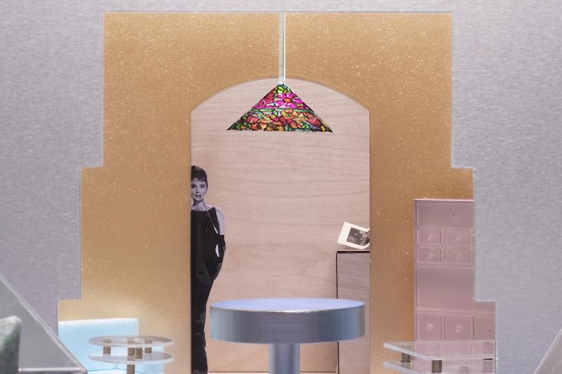
Tiffany already operates several retail spaces in the French capital. But for the launch of its first jewelry collection since 2021, when the 185-year-old American brand was acquired by LVMH, it tapped theRotterdam-based firm OMA, founded by Rem Koolhaas, to design the cozy, 861-square-foot space, which opened earlier this year. Tiffany is not the first jewelry house to hire OMA for a Paris outpost: The firm is also behind the design of the Repossi flagship on Place Vendome. The new temporary Paris space also follows another Tiffany collaboration with OMA (in this case, with the firm’s New York studio, led by Shohei Shigematsu), for the overhaul of its New York City flagship on Fifth Avenue.
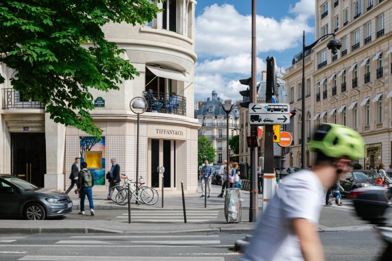
The Paris pop-up occupies a space previously occupied by Dior Joaillerie, on a prime corner of Avenue Montaigne, opposite the newly revamped Dior flagship. It is an appropriate location for this prized addition to the luxury behemoth that also owns brands such as Christian Dior, Louis Vuitton, and Loewe.
“We were given a lot of freedom to come up with fresh ideas,” says OMA partner Ellen van Loon, who notes that the space is meant to serve as a one-year “test case.” “The brief called for a space that brings new energy and a new look to the brand.”
The architects were less concerned with coming up with an efficient retail layout than conveying a message of freshness with a nod to heritage. “Tiffany has a rich legacy, which we felt could be the inspiration for its future. History became an important ‘ingredient’ of our design,” van Loon says.
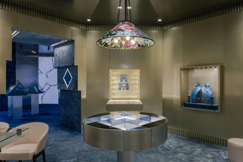
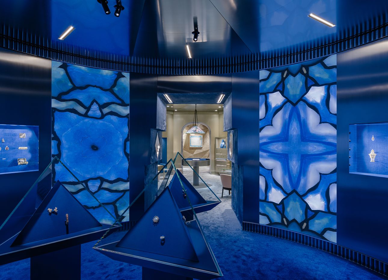
Visitors enter the boutique through a lapis blue-colored rotunda that serves as both exhibition and retail space. On its walls, fabric-lined glass niches and vertical digital screens display vintage Tiffany-designed jewelry. Wall-to-wall blue gradient carpeting fades into a cream shade at the far end of the interior, enhancing a sense of bodily immersion. “The first room is like a cocoon,” van Loon says.
Under the light of antique Tiffany lamps, this month’s curated selection of archival jewelry features highlights from the work of designer Jean Schlumberger (1907–1987), including a charming 1960s “Bird of a Rock” brooch, set with a 128.54-carat yellow diamond, and colorful enameled bangles—a Jackie O. favorite. Next month, the spotlight will be on pieces by Elsa Peretti (1940–2021), widely known for her pure, organic forms and signature sense of pared-down simplicity.
“The decor is adaptive, and the interior will change every three months,” says OMA project architect Giulio Margheri. “Subtle changes throughout the year will create different ambiances that relate to changing collections.”
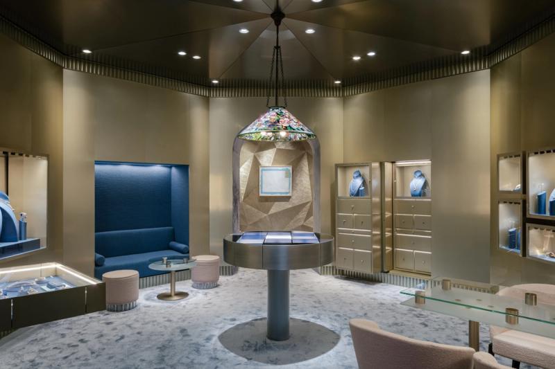
An octagonal-shaped room serves as the store’s main retail area. Lined with gold-colored aluminum panels, it features a bridal section at the center, with a large display case for current collection pieces on one side and a small alcove with a sofa for try-ons on another. Clients seeking privacy can move into the third and final room, a brighter, more intimate space used for appointments.
What’s perhaps most surprising is that the iconic robin’s-egg blue shade known as “Tiffany Blue” is used only sparingly throughout, as an accent color in some display cases and on a pair of monochromatic paintings by the artist Richard Prince. “We found in Tiffany’s archives a wide range of blues, which we incorporated into the design,” Margheri says. He adds that bright yellow was used in the vitrines “to add a touch of color to the overall gray of Paris,” but mostly “to celebrate the new energy of Tiffany.”
