In Brooklyn, a Creative Campus Designed to Slow Artists and Visitors Down
Earlier this month, a stately structure covered in angled white bricks opened its doors in the East Williamsburg area of Brooklyn. It serves as one of four buildings that comprise the New York home of the Amant Foundation, a nonprofit arts organization that values a slow, focused approach in making and viewing art. (It has a sister location in Chiusure, a village in central Italy.) The campus, designed by the New York–based architecture and design studio SO–IL, includes a bookstore, a café, a courtyard, and several galleries—all accessible free of charge—that offer a tranquil environment in which visitors can take in the work on view. Artists’ studios, located across the street, provide time and space for residents to hone their crafts.
The foundation’s inaugural exhibition,“Heroines, Birds, and Monsters” (on view through October 31), features works by Berlin-based Portuguese artist Grada Kilomba in video, earth, and other media that speak to one another across the spaces, and with the people and nature invited inside. Here, SO–IL co-founder Florian Idenburg explains how the firm’s design reflects Amant’s aim to serve artists and the public, and describes the materials used to bring its vision to fruition.
“The starting point for this project was acknowledging that there are many spaces for the arts in New York, and asking what we can add to that ecosystem. The site is hard to reach in some ways. It’s a bit remote, and the area is very industrial and active. A meatpacking plant is on one side of the street, and a storage facility is on the other—so close that the bright yellow of the building is often reflected on the campus’s façade. In part because of this setting, we wanted to create a space that allows for slowing down, and for taking time. Even in the case of Amant’s artist residencies, there’s no pressure to produce something at the end of them. Its ambition is to create a space for artists to work, and to host them in the best possible ways.
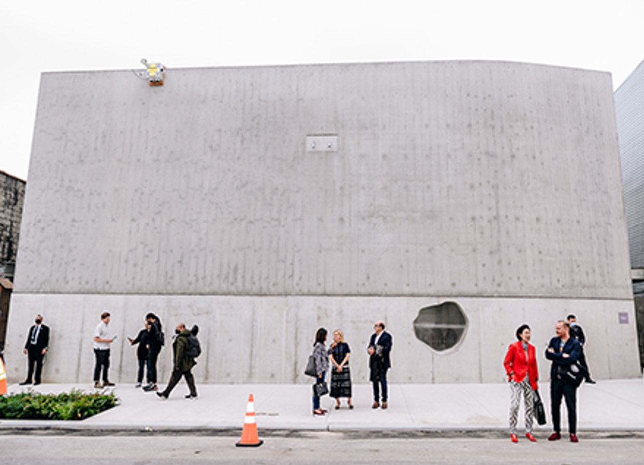
Our challenge was to make four buildings that were connected without being the same. The structures that hold the galleries use two types of brick, and the residency building uses textured, cast-in-place concrete; a brushed concrete walkway links the two. In each case, we wanted to create an infrastructure that would work at the scale of the body, particularly as a visitor travels through the walkways. One of the ways we did this was by introducing a horizontal datum. The buildings are quite tall, and at eight to ten feet [in each space], we broke up the wall height and brought it back to a human scale by switching from smooth to corrugated concrete, or from brick to metal.
I always hope that [our] architecture gives people a sense of place, of where they are on this planet, by evoking a sense of tactility and materiality. Steel, glass, wood, concrete—in architecture, you don’t have so many material choices. Because of this, [people] can get a bit numb to the built environment. We try to misuse these materials, or employ an unconventional use of conventional matter, to create a sense of wonder, and to get people’s attention.”