Google’s First Retail Space Is Simultaneously Tranquil and Teched-Out
Technology, especially when it comes to screen time, can simultaneously induce sensory overload and sensory deprivation. It’s a concept that Suchi Reddy, founder of the New York firm Reddymade Architecture and Design, challenged with her design for Google’s first retail store, which opened last month on the ground floor of the company’s Manhattan headquarters (just blocks from The Slowdown’s Chelsea studio). Reddy worked with Ivy Ross, Google’s VP of hardware design (and the guest on Ep. 11 of our Time Sensitive podcast) toward a singular goal: to create an environment that demonstrates “how humans and technology [can] come together,” as Reddy puts it, through products that are seamlessly integrated into our everyday lives in appealing and practical ways.
Hands-on interaction is encouraged in the store’s fully furnished tableaux, each of which mimics a particular part of a house, such as a living room or a kitchen. All of them are equipped with Google hardware (Pixel phones and Nest products) and software (such as Google Search, Google Assistant, YouTube, or the mobile game device Stadia), allowing visitors to experience them in real-life scenarios. There’s also a workshop space that hosts public events and tutorials, and various 3-D animations, shown on transparent LED screens, that provide information about the company’s latest inventions and how they can be used together.
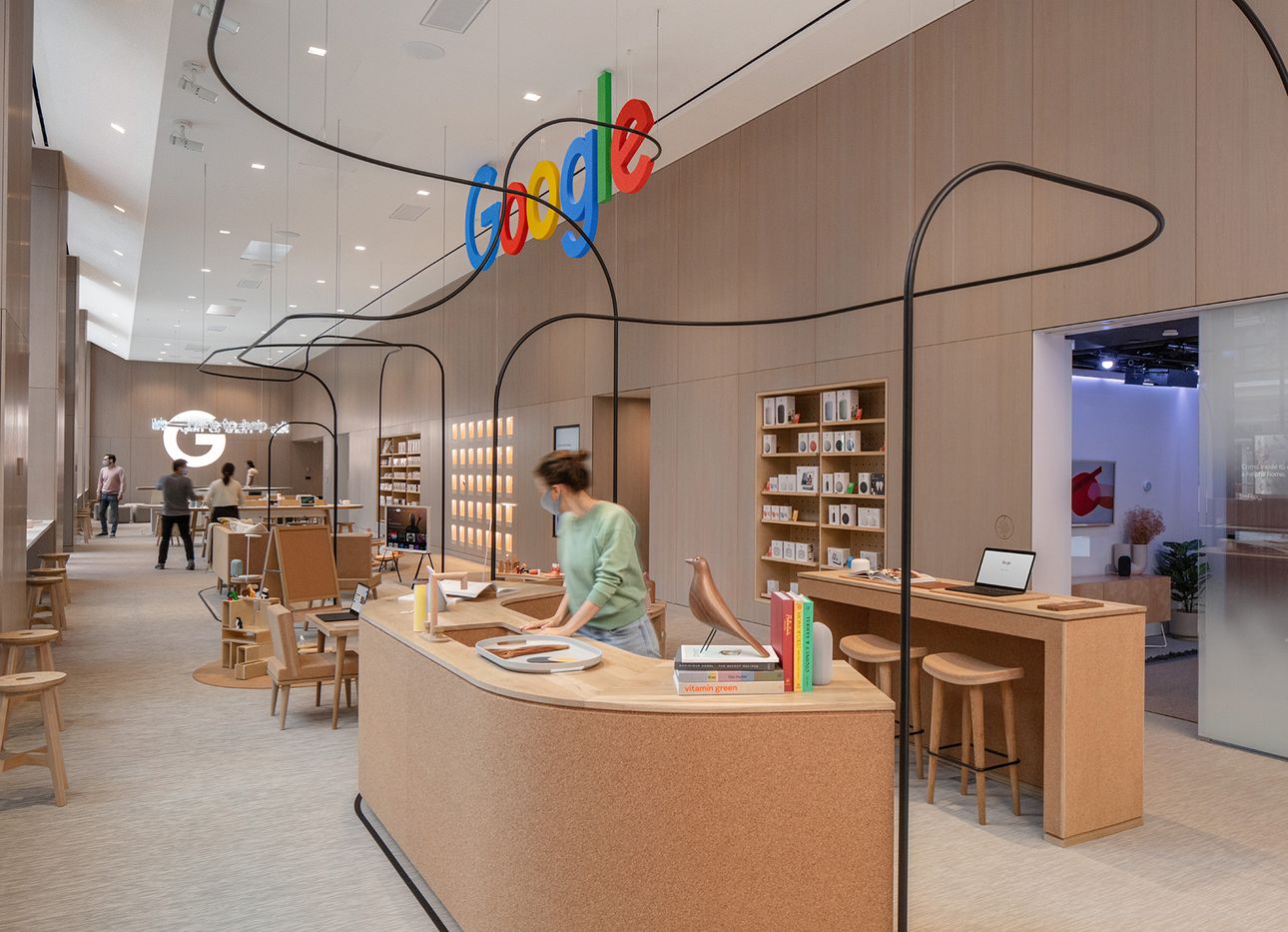
Reddy’s design also draws on the core principles of neuroaesthetics—an emerging discipline that uses neuroscience to understand how people experience beauty in different forms, including color and texture, on a neurological level—which she explored in her design for the installation “A Space for Being,” made in collaboration with Google and shown during Milan Design Week in 2019. (For more on neuroaesthetics, listen to Ep. 34 of our At a Distance podcast featuring Susan Magsamen, the founder and executive director of the International Arts + Mind Lab at Johns Hopkins University.) Consequently, soft, warm-hued, tactile materials facilitate an inviting sense of home throughout the store. Custom cork and wood furniture, made by a Brooklyn craftsman, sits atop muted carpet surrounded by walls clad in a light-gray hickory veneer.
The lone dark accent is a contorted metal rod that twists through the central area, embodying the playful, intuitive spirit of Google’s wares. Even the space’s most explicitly tech-y component, an immersive structure formed by a semicircle of giant LED screens that display various Google platforms (such as Google Translate, the screens’ current focus), feels intimate. In fact, it’s one of Reddy’s favorite parts of the project. “It’s a curved personal experience—a feat of engineering you can interact with,” she says. To engage with the enclosure, or with almost anything in the store, is to glimpse the future: one where technology can delight the hand, mind, and spirit.