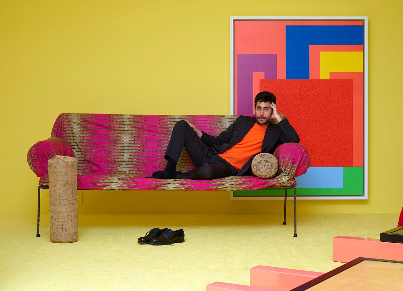
Apartamento Magazine’s Omar Sosa Explores Comfort With a Friedman Benda Show
Omar Sosa, creative director and cofounder of the influential interiors magazine Apartamento, tells us about his first curatorial effort, “Comfort,” a group show of unconventional and provocative art and design works—which range from a wonky Ettore Sottsass bookshelf, to a Bless-designed hammock made of pillows, to a toilet-sink hybrid by Guillermo Santoma—on view through Feb. 15 at New York’s Friedman Benda gallery.
How did the idea for the show begin? What led you to explore the notion of comfort?
Comfort is something that, most of the time, is not considered much in the world of contemporary art objects that could be utilitarian. It’s always been interesting for me when somebody completely outside or unfamiliar with this world looks at a chair and thinks, “Is it really to be used? Is it actually comfortable to sit on?”
It’s exploring the idea of comfort in a physical sense, but also visually and psychologically. At the same time, on a personal level, I’m doing something new and going outside of my comfort zone by curating a show, which for me is really venturing into a different world. It’s hard to say what people will experience—and I want to keep it quite open-ended—but, for me, it’s more about asking questions rather than providing answers.
With Apartamento, you’ve had the chance to step inside the homes of many eccentrics and creatives around the world. How do you feel this has shaped your personal taste?
Seeing so many people’s homes conditions the way you think about your own space, and this is actually one of the reasons that comfort instinctively came up. Maybe the only nondescript rule of Apartamento is that we show people who have a strong expression in their personal environment, which often means a completely different thing from person to person. It’s made me realize that I’m more interested in venturing outside of what I consider beautiful versus not beautiful, or what I like or don’t like—looking at things in that sort of black-and-white way doesn’t apply anymore.
For me, visual comfort is very important, and that comfort is more based on what I find interesting. I prefer to live with objects that are challenging, that you may not like at first, but which slowly grow on you. That comes from having seen so many houses, how different people live with different things, and have different standards of beauty and of comfort.
There seem to be more and more artists working with “functional sculpture,” a blurry middle ground that defies conventional lines between art and design. Of course, there’s a longer history of artists who have done this, but why do you think this approach resonates today?
Today, houses are being turned inside out in a way that has never happened before. With Instagram and social media, it’s easier to show what you have in your house and also see what other people have—there’s a heightened interest and attention to this realm because you can share your sofas as easily as you would, say, your sneakers. What the objects in the show have in common is that they transcend the comfort zone of conventionality. And what I wanted to highlight here, a bit, is that it has been happening for some time—it’s not just a recent phenomenon, though there is obviously more attention and interest to it now. It’s about objects that have a strong and critical art component, but also could be used in your everyday life.
The toilet-sink definitely challenges my comfort zone! One is for cleaning and the other expelling, and yes, you usually see the two together, but not so… close.
That was one of the few works I commissioned for the show. I thought the idea of having such an often disregarded, common, utilitarian everyday object would be a fun way to bring in some humor. Guillermo made his own version of it by combining it with a sink and flattening the surface—it makes fun of the idea that these fixtures just kind of recycle the same water. It’s a challenging piece, and interesting to see alongside other works.
Another piece [in the show] that’s relevant for me is Nicola L.’s “Canapé Homme Geant.” I like the connotations of her being a woman artist, chopping a man into pieces, and then sitting on him. It’s super powerful and feminist. Another important piece is a couch by John Chamberlain. It’s just a beautiful, generous couch to lie down in. It’s so simple—he cut some foam and put a parachute over it. It’s one of the contrasting pieces of the show. When you see this together with the others, it’s meant for you to be like, “Oh, that’s comfort!”